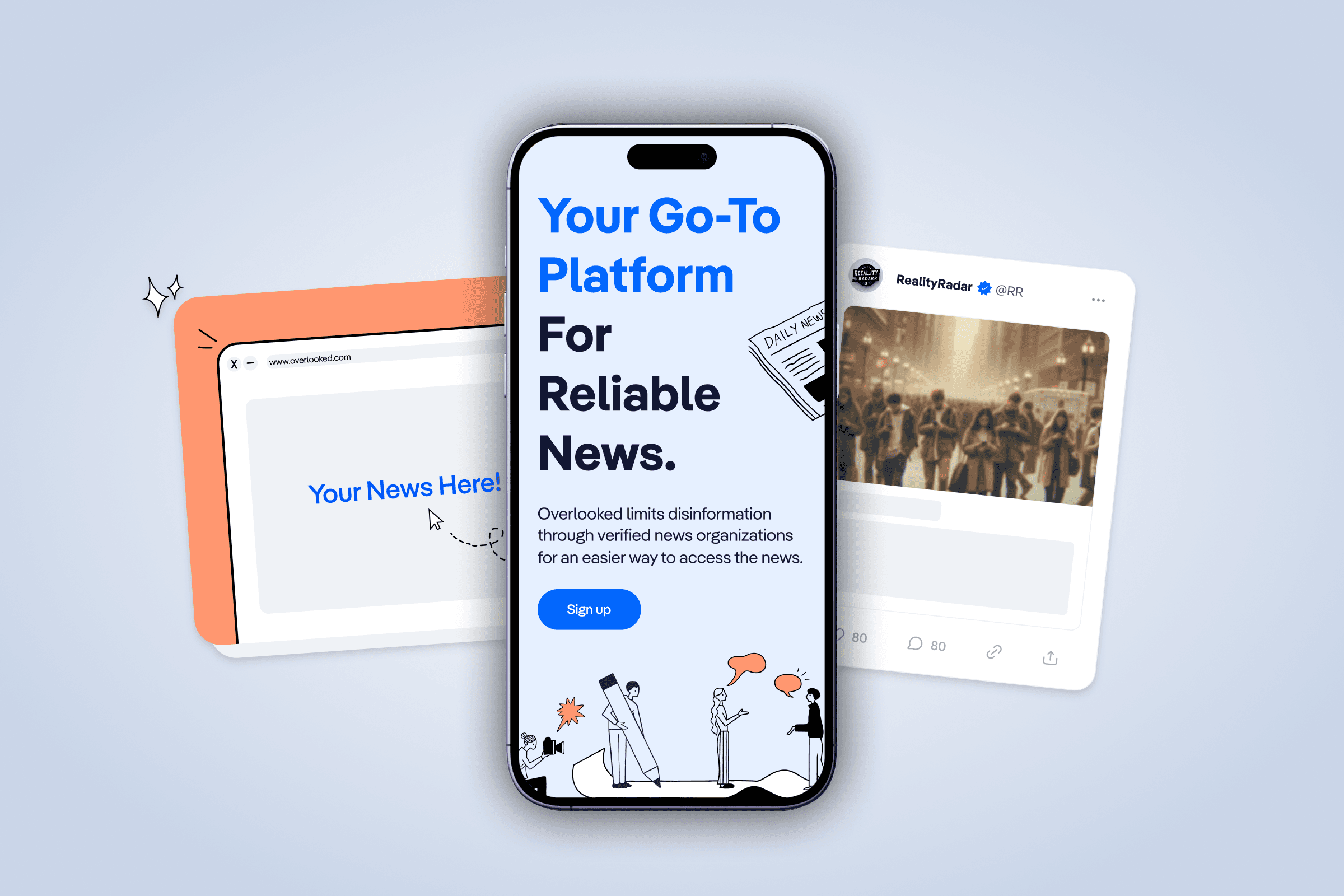
Overlooked
My Role
Lead Product Designer - Visual Design, User Flows,
Brand Direction
Team
Seyoung Kim, Illustrator
Clifford Chong, Brand Designer
Kevin Tome, Logo Designer
Timeline & Result
4 months,
Launched in 2023
Tools
Figma, Notion.
Overview
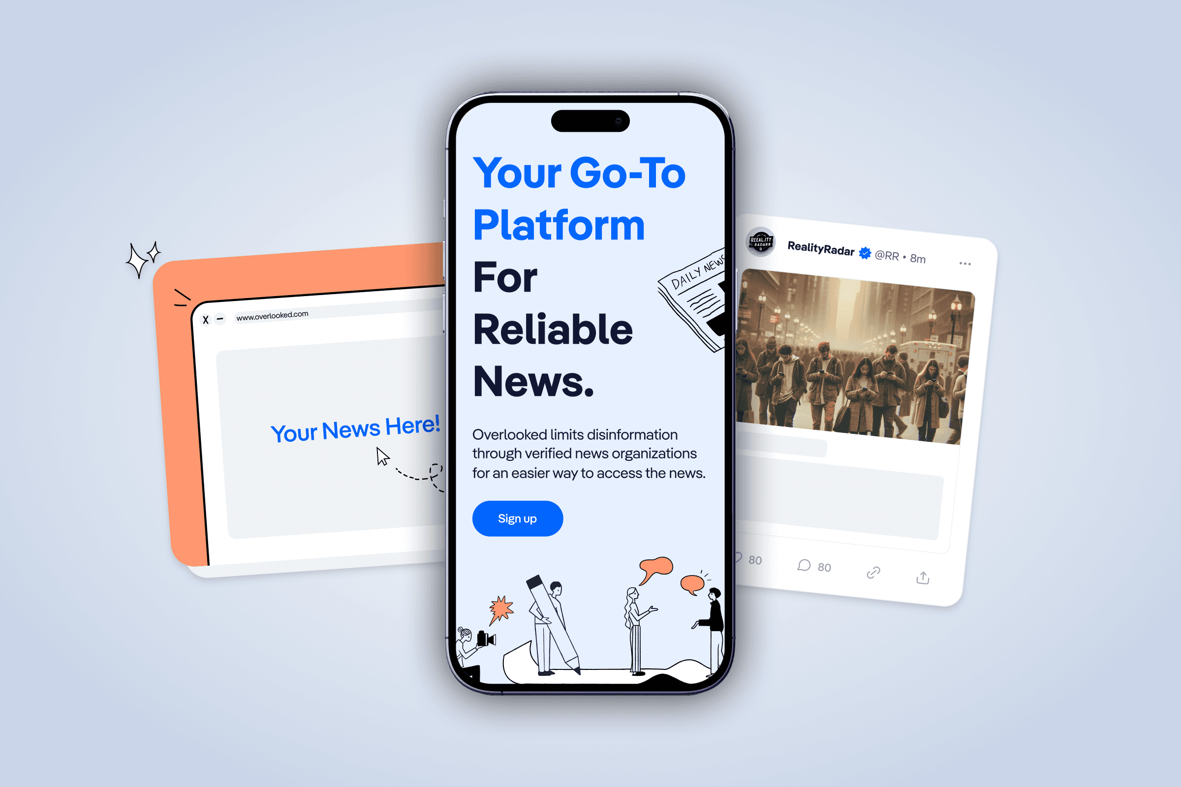
As the lead designer for Overlooked, I managed the entire product redesign, working closely with the client to revamp the product and establish a compelling brand presence. This involved refining the design from initial concepts to high-fidelity ensuring it effectively communicated the client's vision and goals.
While the platform remains a work in progress, our rebranding efforts and design enhancements have been met with client satisfaction, effectively conveying their brand vision and objective.
HIGHLIGHTS
A platform redesign, prioritizing brand presence and enhancing user experience
0.1
Logo
IMAGE
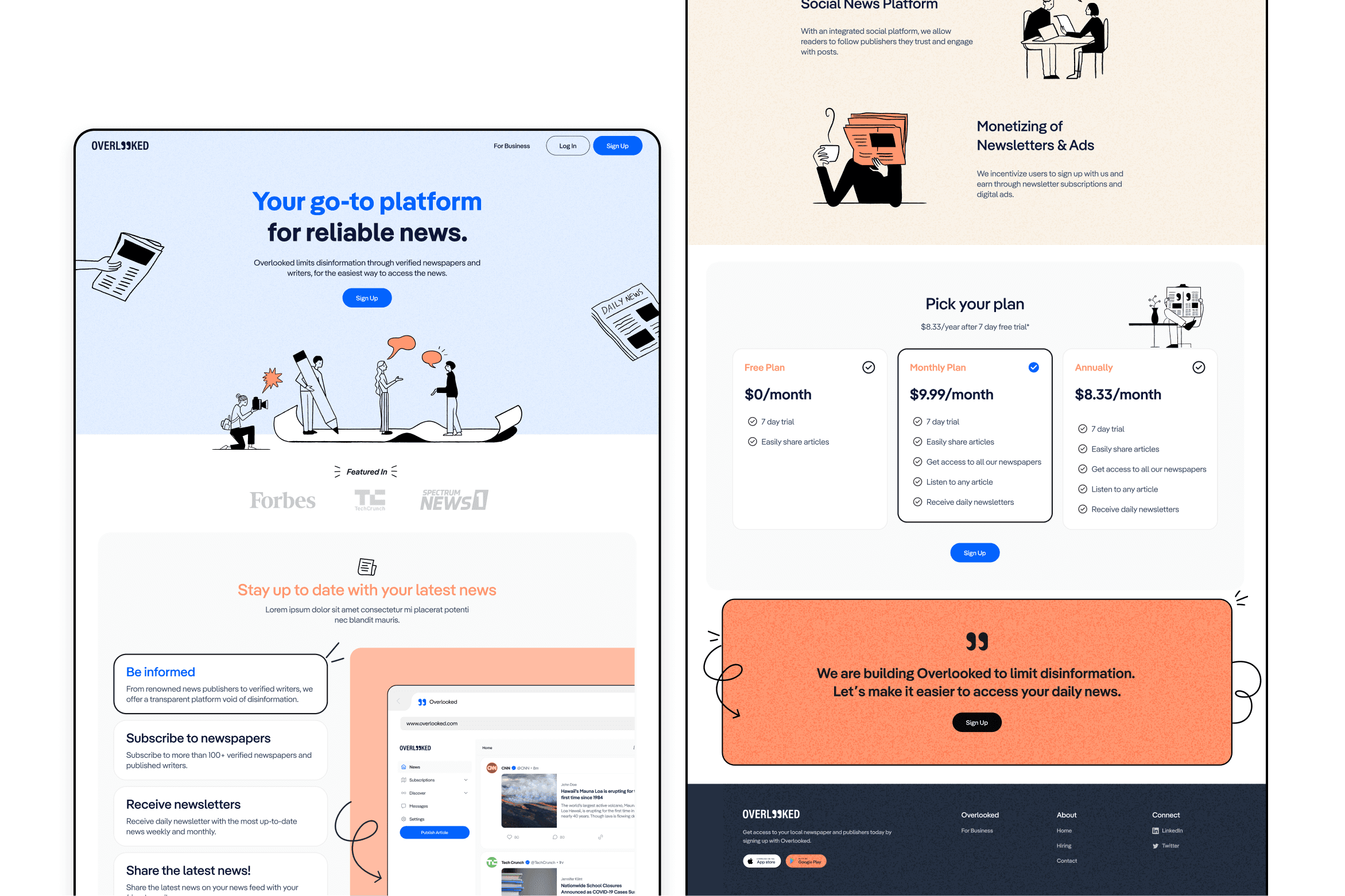
0.2
Landing Page
IMAGE
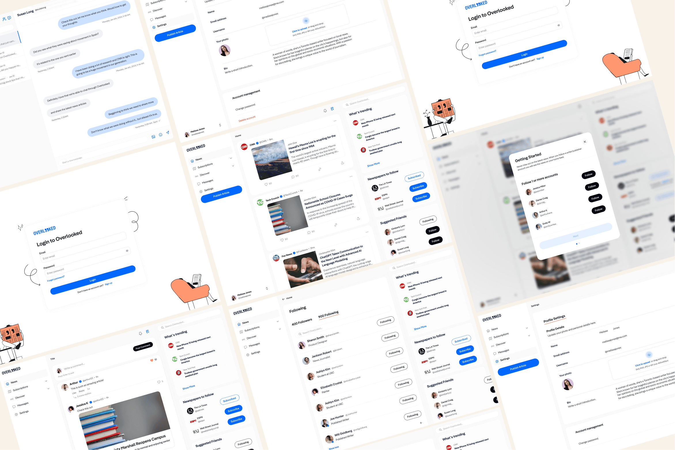
0.3
Desktop Mockups
IMAGE
CONTEXT
Rebrand Focus Areas
01
Branding Refresh
The project started with a brand identity refresh, including moodboarding, logo selection, and finalizing visual assets.
02
Landing Page Launch
We emphasized the launch of the landing page serving as a central hub for the audience to explore the platform's offerings.
03
UI Refresh & Redesign
Social networks face difficulties in helping users showcase extensive career achievements across multiple job experiences.
PROBLEM
Constraints we were working with.
The project started with a crucial brand refresh and website launch, but the condensed three-month timeline required a comprehensive redesign of the platform.
A tight deadline called for a comprehensive platform redesign, leaving insufficient room for extensive research and in-depth analysis.
Design resource constraints: As the sole designer overseeing the project, resource allocation became a challenge, requiring efficient management.
Positioning Ambiguity: Clarifying Overlooked's unique stance in the news platform landscape and creating a clear value prop to attract both readers and writers.
tHE CHALLENGE
How might we redesign Overlooked into a trusted news platform that promotes genuine and reliable news?
USER FLOWS
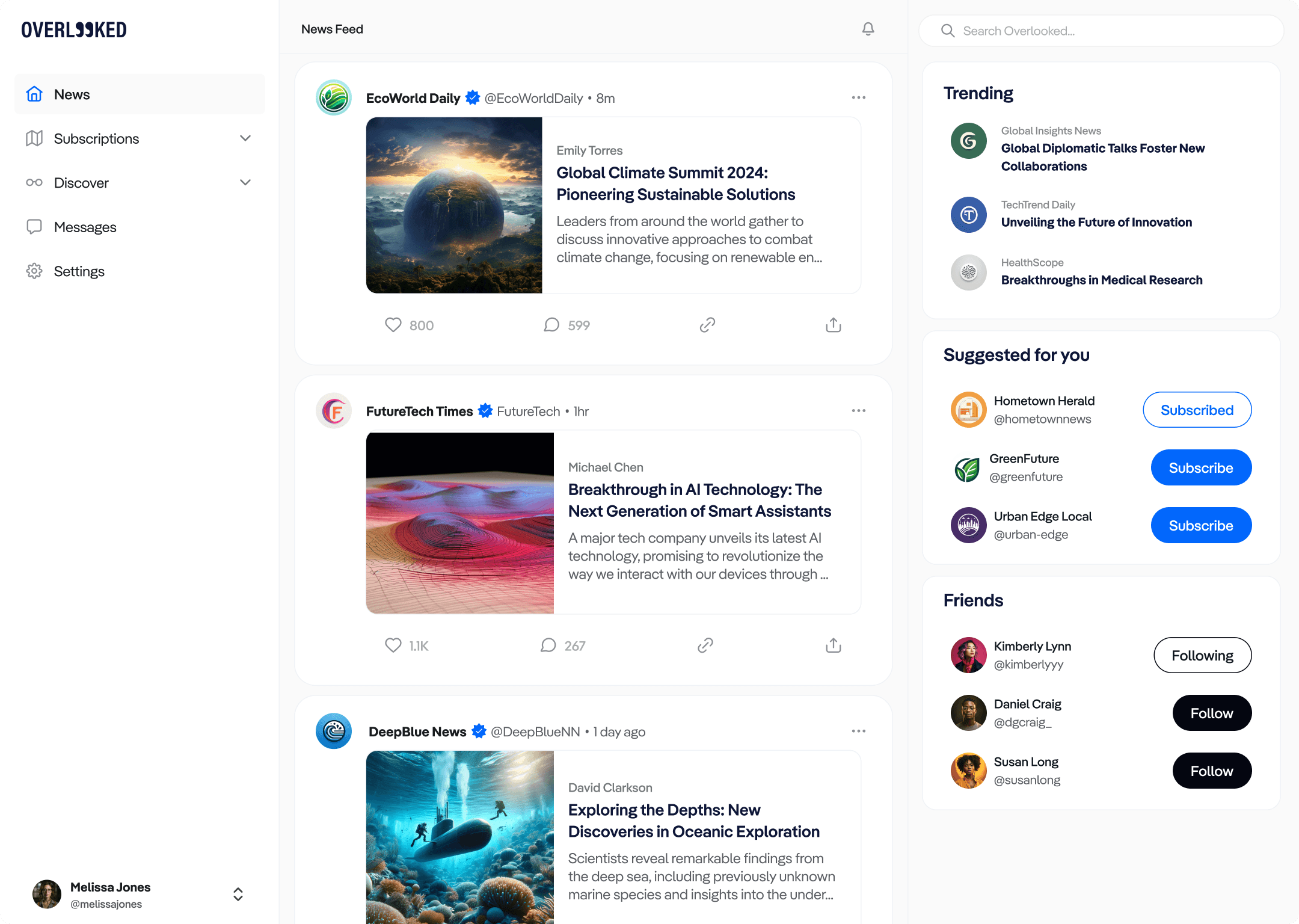
News Feed
Our goal was to revamp the existing news feed experience, infusing it with a more spacious and uplifting approach. This transformation garnered positive feedback from our client
Simplicity and Clarity
We redesigned the Overlooked news feed, prioritizing clarity and ease of use while preserving key functionalities like feeds, trending topics, and suggested articles. Our goal was to create a familiar and user-friendly experience for staying informed.
0.4
News Feed
IMAGE
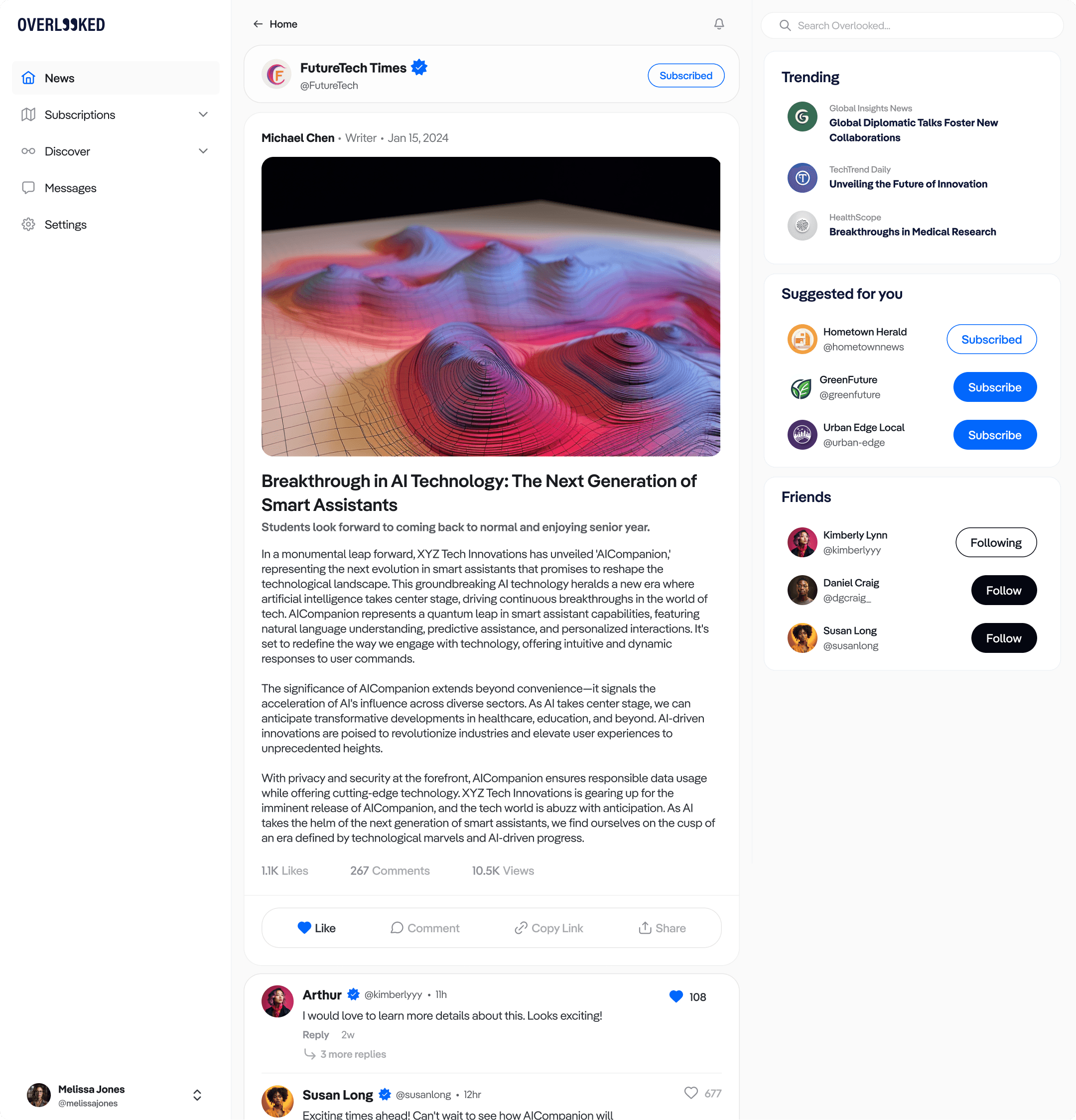
Article View
Our goal was to craft a dynamic and scalable news feed that delivers impactful news, fosters engagement, and enhances visibility of vital updates and stories.
Readability, Layout, Hierarchy
The article view has undergone a comprehensive transformation, with a sharp focus on optimizing layout, refining information hierarchy, and ensuring effortless readability.
0.5
Viewing an article
IMAGE
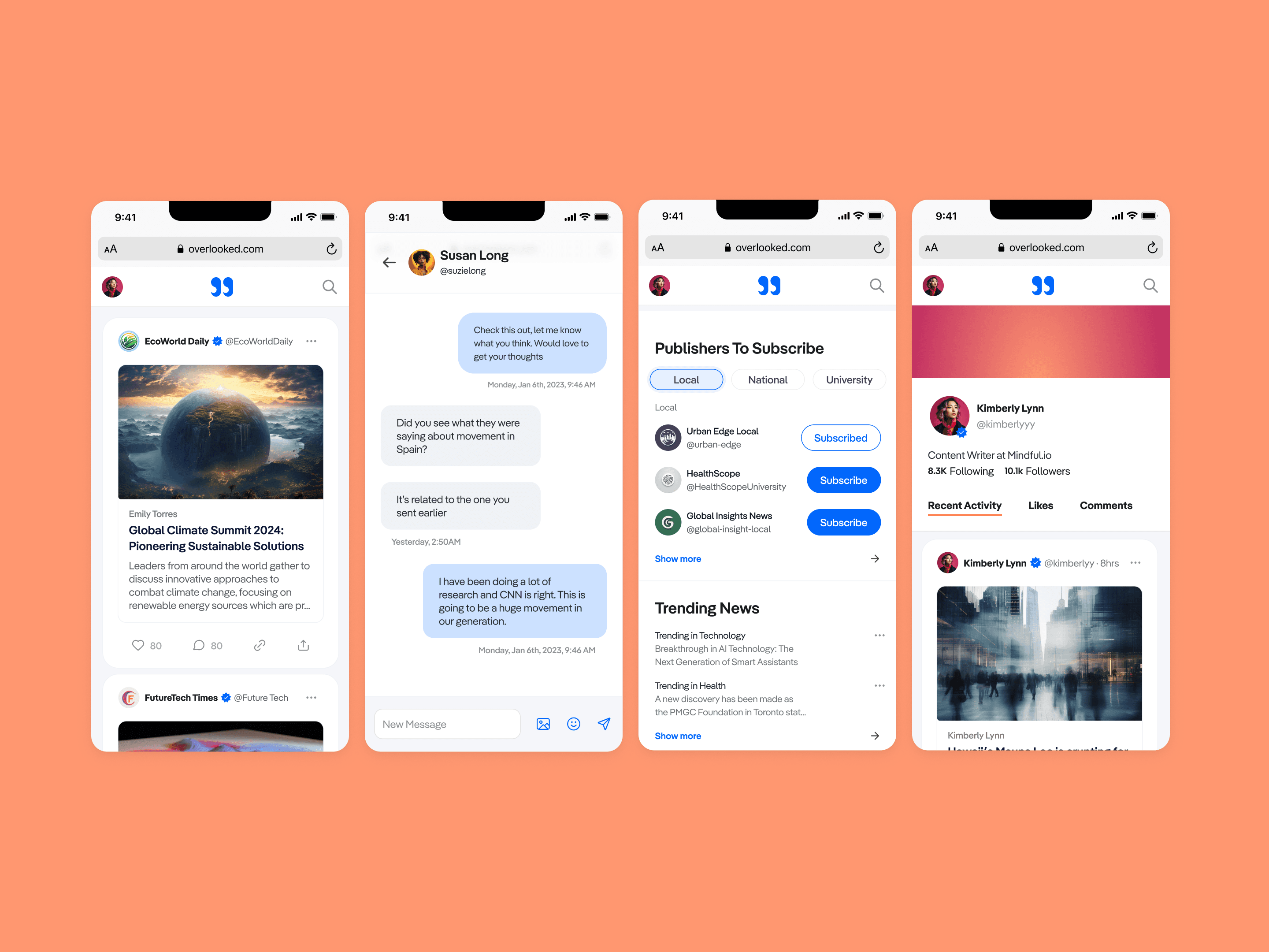
A glimpse into Overlooked
We aimed to enhance the mobile experience by ensuring full responsiveness and incorporating user-friendly features such as seamless messaging, easy commenting, and more, aligning with the evolving preferences of our users on the go.
Accessible and Responsive
Our primary objective was to enhance the mobile experience by ensuring full responsiveness and incorporating user-friendly features such as seamless messaging, easy commenting, and more, aligning with the evolving preferences of our users on the go.
0.6
Mobile Mockups
IMAGE
RETROSPECTIVE
Looking to the future
THE FINAL MOMENTS
Overlooked is gaining momentum as users engage with trustworthy news sources, marking a promising start in it's mission to combat disinformation.
Project Takeaways
Early Alignment Yields Success
Establishing a shared mission and clear goals from the start sets the foundation for a successful project
Focus on Core Features
Prioritizing a few key features for improvement within a tight timeline can lead to a more impactful redesign
Exploring Options Pays Off
Investing in research and experimentation leads to better solutions and a more refined user experience
User Testing Matters
Engaging with a larger user base would have been even more beneficial for the platform redesign
Ribbon
My Role
Lead Product Designer - Visual Design, User Flows, Brand Direction
Team
Seyoung Kim, Illustrator
Clifford Chong, Brand Designer
Kevin Tome, Logo Designer
Timeline & Result
4 months,
Launched in 2023
Tools
Figma, Notion.
Overview
As the lead designer for Overlooked, I managed the entire product redesign, working closely with the client to revamp the product and establish a compelling brand presence. This involved refining the design from initial concepts to high-fidelity ensuring it effectively communicated the client's vision and goals.
While the platform remains a work in progress, our rebranding efforts and design enhancements have been met with client satisfaction, effectively conveying their brand vision and objective.
HIGHLIGHTS
A platform redesign, prioritizing brand presence and enhancing user experience.

0.1
Logo

0.2
Landing Page

0.3
Desktop Mockups
CONTEXT
Rebrand Focus Areas
03
Branding Refresh
The project started with a brand identity refresh, including moodboarding, logo selection, and finalizing visual assets.
01
Landing Page Launch
We emphasized the launch of the landing page serving as a central hub for the audience to explore the platform's offerings.
02
UI Refresh & Redesign
Social networks face difficulties in helping users showcase extensive career achievements across multiple job experiences.
PROBLEM
Constraints we were working with.
The project started with a crucial brand refresh and website launch, but the condensed three-month timeline required a comprehensive redesign of the platform.
A tight deadline called for a comprehensive platform redesign, leaving insufficient room for extensive research and in-depth analysis.
Design resource constraints: As the sole designer overseeing the project, resource allocation became a challenge, requiring efficient management.
Positioning Ambiguity: Clarifying Overlooked's unique stance in the news platform landscape and creating a clear value prop to attract both readers and writers.
tHE CHALLENGE
The project started with a crucial brand refresh and website launch, but the condensed three-month timeline required a comprehensive redesign of the platform.
USER FLOWS
News Feed
Our goal was to revamp the existing news feed experience, infusing it with a more spacious and uplifting approach. This transformation garnered positive feedback from our client
Simplicity and Clarity
We redesigned the Overlooked news feed, prioritizing clarity and ease of use while preserving key functionalities like feeds, trending topics, and suggested articles. Our goal was to create a familiar and user-friendly experience for staying informed.

0.4
News Feed
Article View
Our goal was to craft a dynamic and scalable news feed that delivers impactful news, fosters engagement, and enhances visibility of vital updates and stories.
Readability, Layout, Hierarchy
The article view has undergone a comprehensive transformation, with a sharp focus on optimizing layout, refining information hierarchy, and ensuring effortless readability.

0.5
Viewing an article
A glimpse into Overlooked
We aimed to enhance the mobile experience by ensuring full responsiveness and incorporating user-friendly features such as seamless messaging, easy commenting, and more, aligning with the evolving preferences of our users on the go.
Accessible and Responsive
Our primary objective was to enhance the mobile experience by ensuring full responsiveness and incorporating user-friendly features such as seamless messaging, easy commenting, and more, aligning with the evolving preferences of our users on the go.

0.6
Mobile Mockups
RETROSPECTIVE
Looking to the future
THE FINAL MOMENTS
Overlooked is gaining momentum as users engage with trustworthy news sources, marking a promising start in it's mission to combat disinformation.
Project Takeaways
Early Alignment Yields Success
Establishing a shared mission and clear goals from the start sets the foundation for a successful project
Focus on Core Features
Anticipate diverse user pathways, considering all use cases using the CRUD method.
Exploring Options Pays Off
Investing in research and experimentation leads to better and more refined user experience
User Testing Matters
Engaging with a larger user base would have been even more beneficial for the platform redesign

Overlooked
My Role
Lead Product Designer - Visual Design, User Flows, Brand Direction
Team
Seyoung Kim, Illustrator
Clifford Chong, Brand Designer
Kevin Tome, Logo Designer
Timeline & Result
4 months,
Launched in 2023
Tools
Figma, Notion.
Overview
As the lead designer for Overlooked, I managed the entire product redesign, working closely with the client to revamp the product and establish a compelling brand presence. This involved refining the design from initial concepts to high-fidelity ensuring it effectively communicated the client's vision and goals.
While the platform remains a work in progress, our rebranding efforts and design enhancements have been met with client satisfaction, effectively conveying their brand vision and objective.
HIGHLIGHTS
A platform redesign, prioritizing brand presence and enhancing user experience.

0.1
Logo

0.2
Landing Page

0.3
Desktop Mockups
CONTEXT
Rebrand Focus Areas
03
Branding Refresh
The project started with a brand identity refresh, including moodboarding, logo selection, and finalizing visual assets.
01
Landing Page Launch
We emphasized the launch of the landing page serving as a central hub for the audience to explore the platform's offerings.
02
UI Refresh & Redesign
Social networks face difficulties in helping users showcase extensive career achievements across multiple job experiences.
PROBLEM
Constraints we were working with.
The project started with a crucial brand refresh and website launch, but the condensed three-month timeline required a comprehensive redesign of the platform.
A tight deadline called for a comprehensive platform redesign, leaving insufficient room for extensive research and in-depth analysis.
Design resource constraints: As the sole designer overseeing the project, resource allocation became a challenge, requiring efficient management.
Positioning Ambiguity: Clarifying Overlooked's unique stance in the news platform landscape and creating a clear value prop to attract both readers and writers.
tHE CHALLENGE
The project started with a crucial brand refresh and website launch, but the condensed three-month timeline required a comprehensive redesign of the platform.
USER FLOWS
News Feed
Our goal was to revamp the existing news feed experience, infusing it with a more spacious and uplifting approach. This transformation garnered positive feedback from our client
Simplicity and Clarity
We redesigned the Overlooked news feed, prioritizing clarity and ease of use while preserving key functionalities like feeds, trending topics, and suggested articles. Our goal was to create a familiar and user-friendly experience for staying informed.

0.4
News Feed
Article View
Our goal was to craft a dynamic and scalable news feed that delivers impactful news, fosters engagement, and enhances visibility of vital updates and stories.
Readability, Layout, Hierarchy
The article view has undergone a comprehensive transformation, with a sharp focus on optimizing layout, refining information hierarchy, and ensuring effortless readability.

0.5
Viewing an article
A glimpse into Overlooked
We aimed to enhance the mobile experience by ensuring full responsiveness and incorporating user-friendly features such as seamless messaging, easy commenting, and more, aligning with the evolving preferences of our users on the go.
Accessible and Responsive
Our primary objective was to enhance the mobile experience by ensuring full responsiveness and incorporating user-friendly features such as seamless messaging, easy commenting, and more, aligning with the evolving preferences of our users on the go.

0.6
Mobile Mockups
RETROSPECTIVE
Looking to the future
THE FINAL MOMENTS
Overlooked is gaining momentum as users engage with trustworthy news sources, marking a promising start in it's mission to combat disinformation.
Project Takeaways
Early Alignment Yields Success
Establishing a shared mission and clear goals from the start sets the foundation for a successful project
Focus on Core Features
Anticipate diverse user pathways, considering all use cases using the CRUD method.
Exploring Options Pays Off
Investing in research and experimentation leads to better and more refined user experience
User Testing Matters
Engaging with a larger user base would have been even more beneficial for the platform redesign

Overlooked
My Role
Lead Product Designer - Visual Design, User Flows, Brand Direction
Team
Seyoung Kim, Illustrator
Clifford Chong, Brand Designer
Kevin Tome, Logo Designer
Timeline & Result
4 months,
Launched in 2023
Tools
Figma, Notion.
Overview
As the lead designer for Overlooked, I managed the entire product redesign, working closely with the client to revamp the product and establish a compelling brand presence. This involved refining the design from initial concepts to high-fidelity ensuring it effectively communicated the client's vision and goals.
While the platform remains a work in progress, our rebranding efforts and design enhancements have been met with client satisfaction, effectively conveying their brand vision and objective.
HIGHLIGHTS
A platform redesign, prioritizing brand presence and enhancing user experience.

0.1
Logo

0.2
Landing Page

0.3
Desktop Mockups
CONTEXT
Rebrand Focus Areas
03
Branding Refresh
The project started with a brand identity refresh, including moodboarding, logo selection, and finalizing visual assets.
01
Landing Page Launch
We emphasized the launch of the landing page serving as a central hub for the audience to explore the platform's offerings.
02
UI Refresh & Redesign
Social networks face difficulties in helping users showcase extensive career achievements across multiple job experiences.
PROBLEM
Constraints we were working with.
The project started with a crucial brand refresh and website launch, but the condensed three-month timeline required a comprehensive redesign of the platform.
A tight deadline called for a comprehensive platform redesign, leaving insufficient room for extensive research and in-depth analysis.
Design resource constraints: As the sole designer overseeing the project, resource allocation became a challenge, requiring efficient management.
Positioning Ambiguity: Clarifying Overlooked's unique stance in the news platform landscape and creating a clear value prop to attract both readers and writers.
tHE CHALLENGE
The project started with a crucial brand refresh and website launch, but the condensed three-month timeline required a comprehensive redesign of the platform.
USER FLOWS
News Feed
Our goal was to revamp the existing news feed experience, infusing it with a more spacious and uplifting approach. This transformation garnered positive feedback from our client
Simplicity and Clarity
We redesigned the Overlooked news feed, prioritizing clarity and ease of use while preserving key functionalities like feeds, trending topics, and suggested articles. Our goal was to create a familiar and user-friendly experience for staying informed.

0.4
News Feed
Article View
Our goal was to craft a dynamic and scalable news feed that delivers impactful news, fosters engagement, and enhances visibility of vital updates and stories.
Readability, Layout, Hierarchy
The article view has undergone a comprehensive transformation, with a sharp focus on optimizing layout, refining information hierarchy, and ensuring effortless readability.

0.5
Viewing an article
A glimpse into Overlooked
We aimed to enhance the mobile experience by ensuring full responsiveness and incorporating user-friendly features such as seamless messaging, easy commenting, and more, aligning with the evolving preferences of our users on the go.
Accessible and Responsive
Our primary objective was to enhance the mobile experience by ensuring full responsiveness and incorporating user-friendly features such as seamless messaging, easy commenting, and more, aligning with the evolving preferences of our users on the go.

0.6
Mobile Mockups
RETROSPECTIVE
Looking to the future
THE FINAL MOMENTS
Overlooked is gaining momentum as users engage with trustworthy news sources, marking a promising start in it's mission to combat disinformation.
Project Takeaways
Early Alignment Yields Success
Establishing a shared mission and clear goals from the start sets the foundation for a successful project
Focus on Core Features
Anticipate diverse user pathways, considering all use cases using the CRUD method.
Exploring Options Pays Off
Investing in research and experimentation leads to better and more refined user experience
User Testing Matters
Engaging with a larger user base would have been even more beneficial for the platform redesign