Ribbon
My Role
Product Designer - Visual Design, User Flows, Design systems.
Team
Emily Chung, Lead
Wei-ee Ying, Brand Designer
Timeline & Result
8 months,
Launched in March 2023.
Tools
Figma, Notion, Whimsical, Maze.
Overview
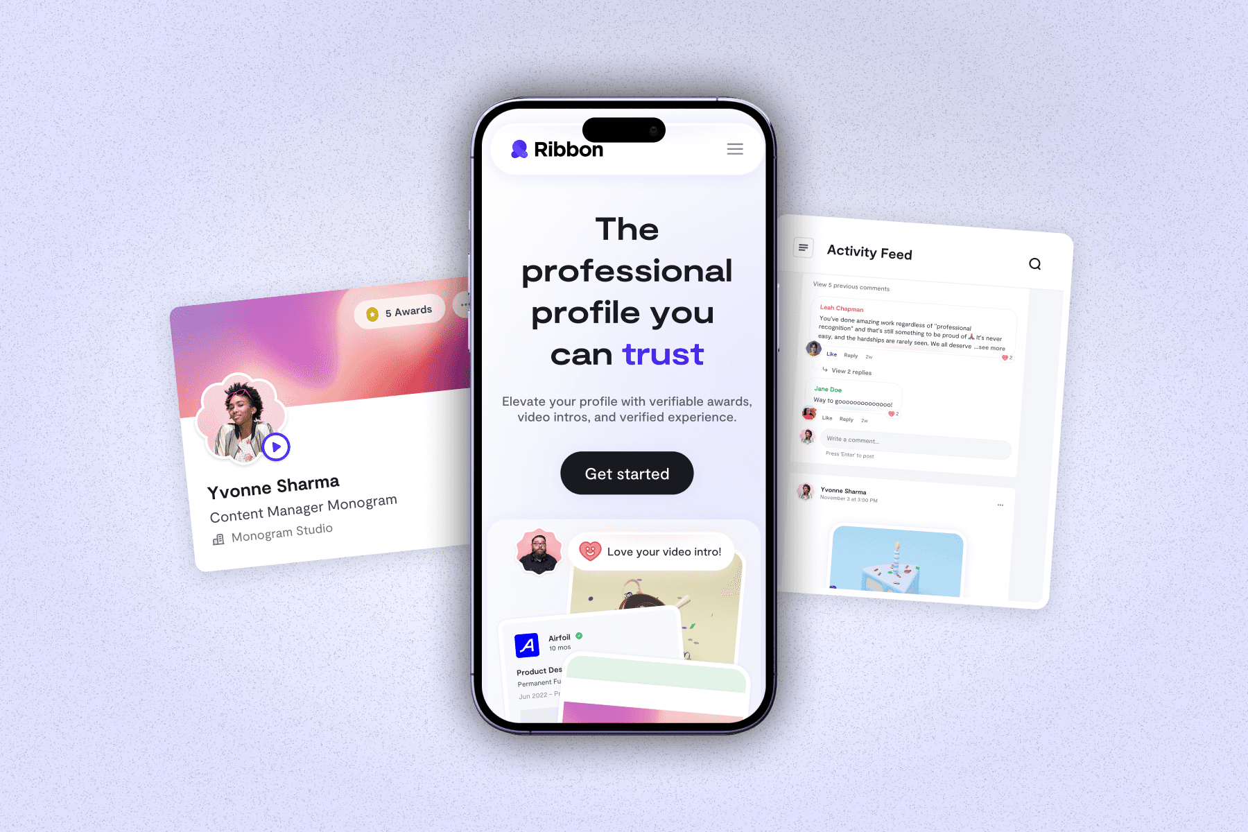
I co-led the complete design lifecycle for Ribbon, a professional social network, overseeing web and mobile experiences for key features.
From concept and low-fidelity wireframes to refined high-fidelity designs, I played a pivotal role in shaping the overall design direction.
The launch received exceptional community feedback, with over 100K signups, marking a successful introduction to the market.
HIGHLIGHTS
An end-to-end updated experience, turning Ribbon into a professional networking and career advancement platform
0.1
Landing Page
VIDEO LOOP
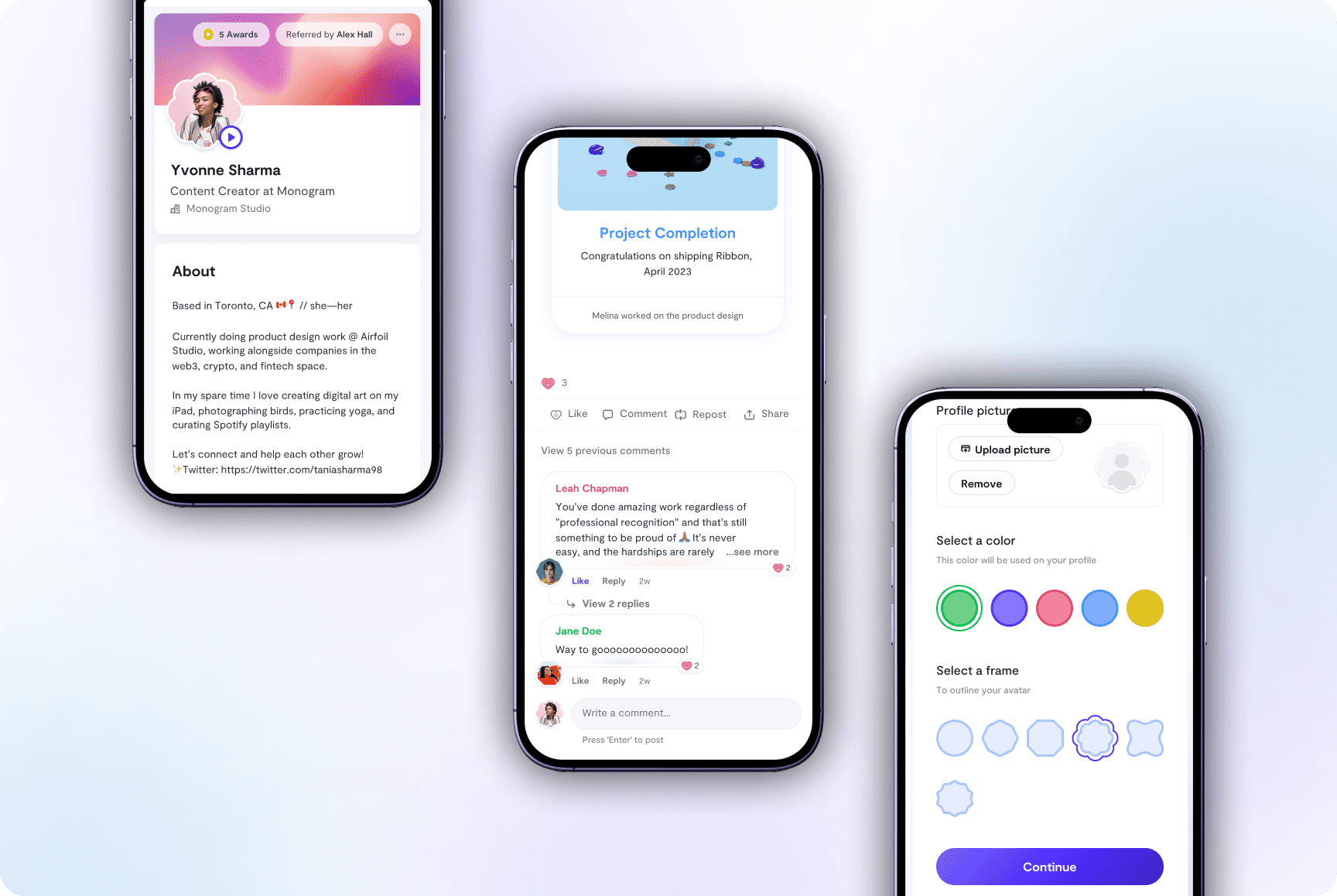
0.2
Mobile Mockups
IMAGE
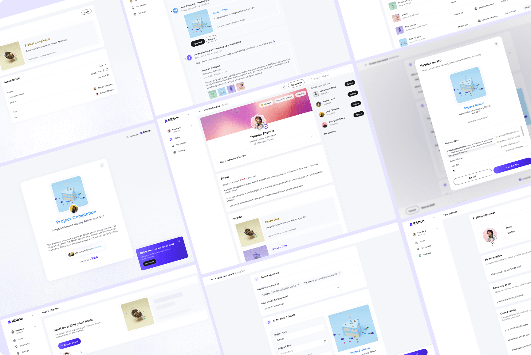
0.3
Desktop Mockups
IMAGE
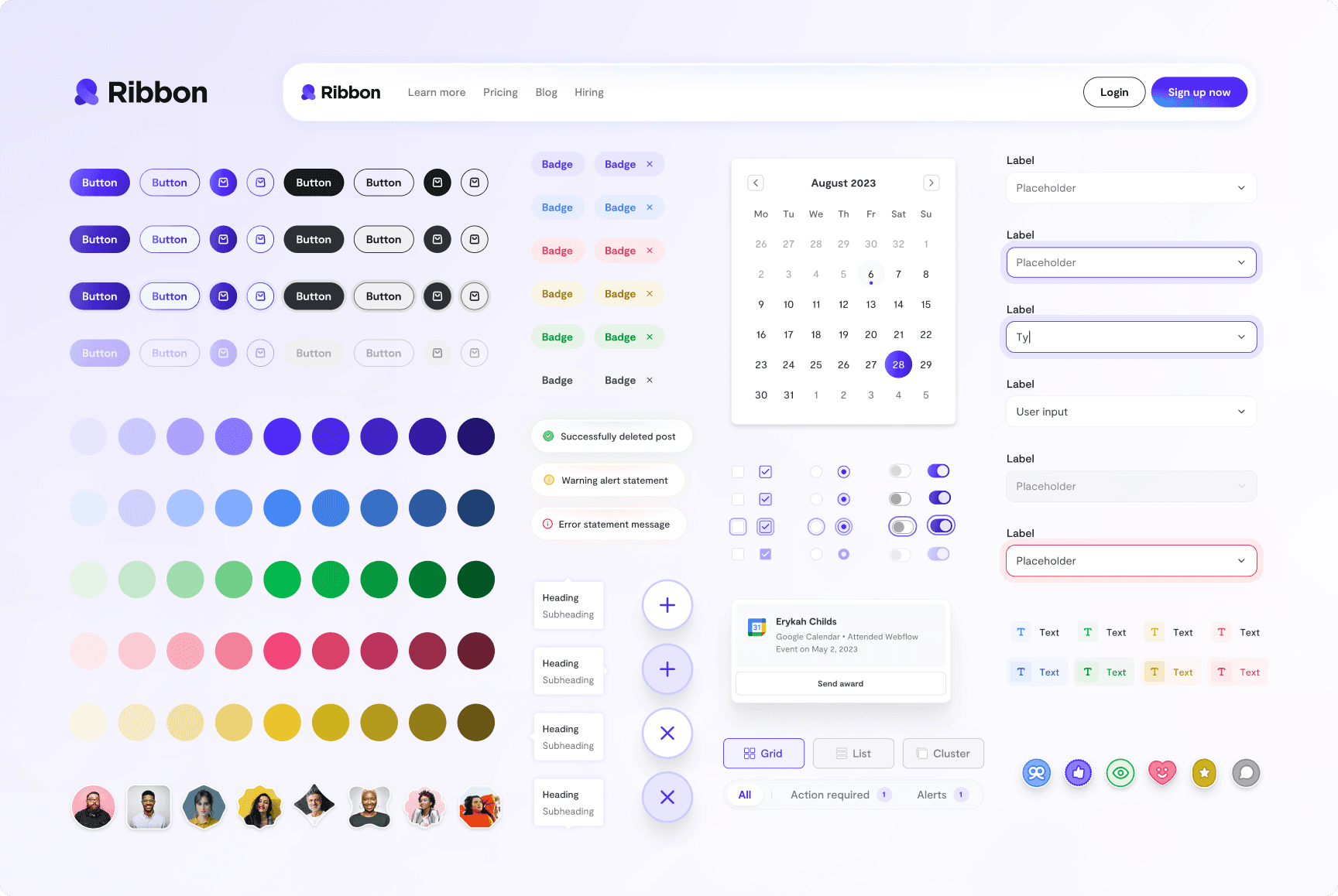
0.4
Design System Components
IMAGE
CONTEXT
The current social networking experience
3 key issues that needed to be addressed:
01
Lack of Trust and Reliability
User trust is a significant concern due to self-reported data and LinkedIn's removal of 21 million fake accounts (Jan-June 2022).
02
Exhaustive AI Content Overload
Users face an excess of AI-generated content, including 576,562 fake Apple employment listings reported on LinkedIn.
03
Limited Professional Showcase
Social networks face difficulties in helping users showcase extensive career achievements across multiple job experiences.
PROBLEM
Constraints we were working with.
The project commenced with a critical visual identity and website launch, but the tight six-month deadline demanded a complete LinkedIn-like redesign with a comprehensive design system
Ambitious six-month deadline: The tight timeline imposed the need for a complete LinkedIn-like redesign of the platform, starting from scratch.
An extensive design system was vital for developer understanding and collaboration in both development and maintenance.
Multi-use case complexity: Adapting to various user types (individuals and companies) under tight feature deadlines added for more feature complexity.
tHE CHALLENGE
Redefining the conventional social networking experience into a
trustworthy and authentic platform
USER FLOWS
Design User Profiles
Our goal was to differentiate ourselves from traditional social media profiles. We designed a refreshing way to setup and display profile details, which was enthusiastically embraced by the Ribbon community.
Customizable & Modular
We empowered users with modularity and customization, offering drag-and-drop templates, customizable avatars, and diverse profile options like projects and video introductions for a personalized experience.
0.5
Editing Profile
IMAGE
Highlight Achievements
We empowered users to showcase awards and achievements with creative layouts and integrated them seamlessly into timeline modules for enhanced visibility
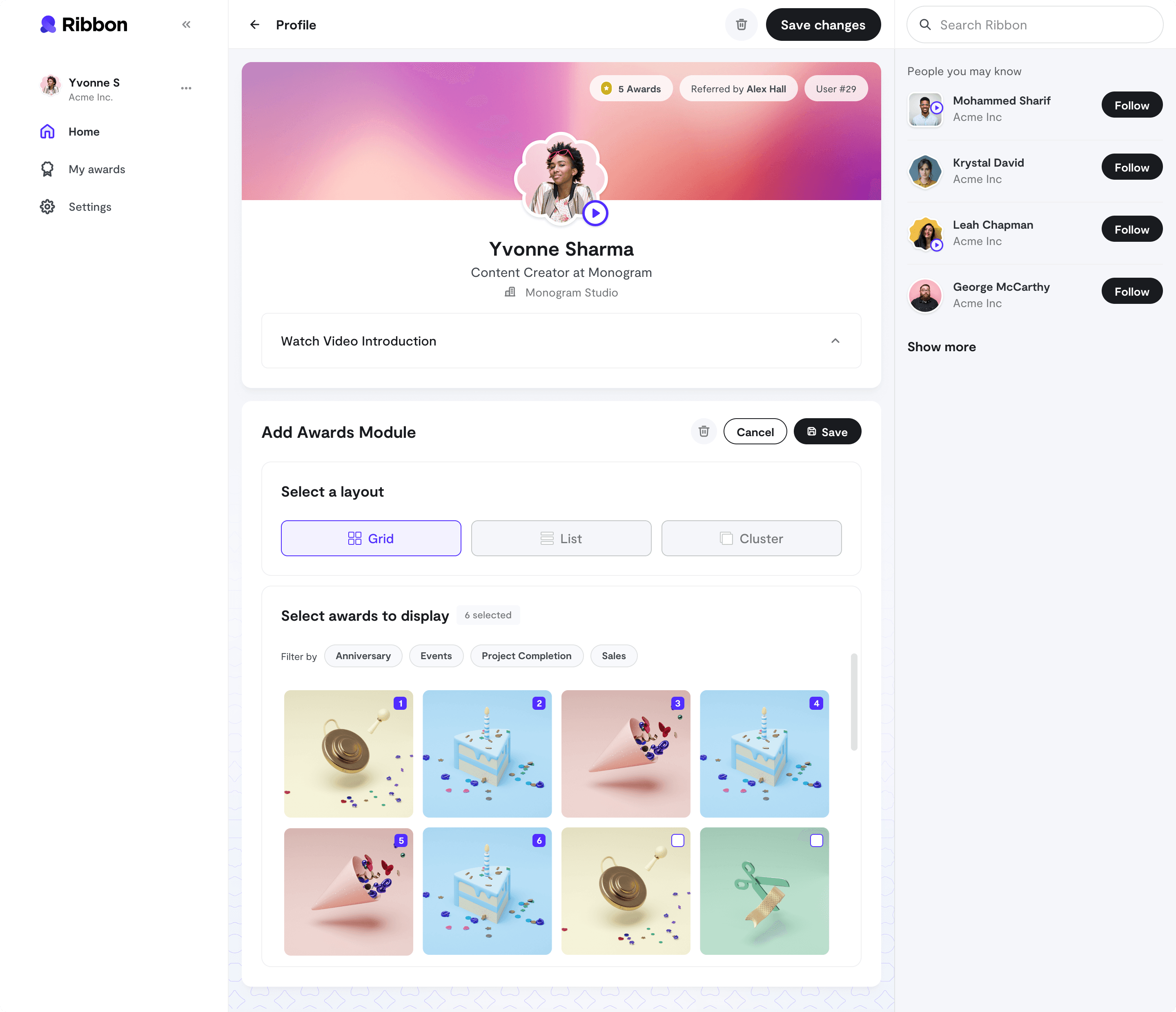
0.6
Awards Module
IMAGE
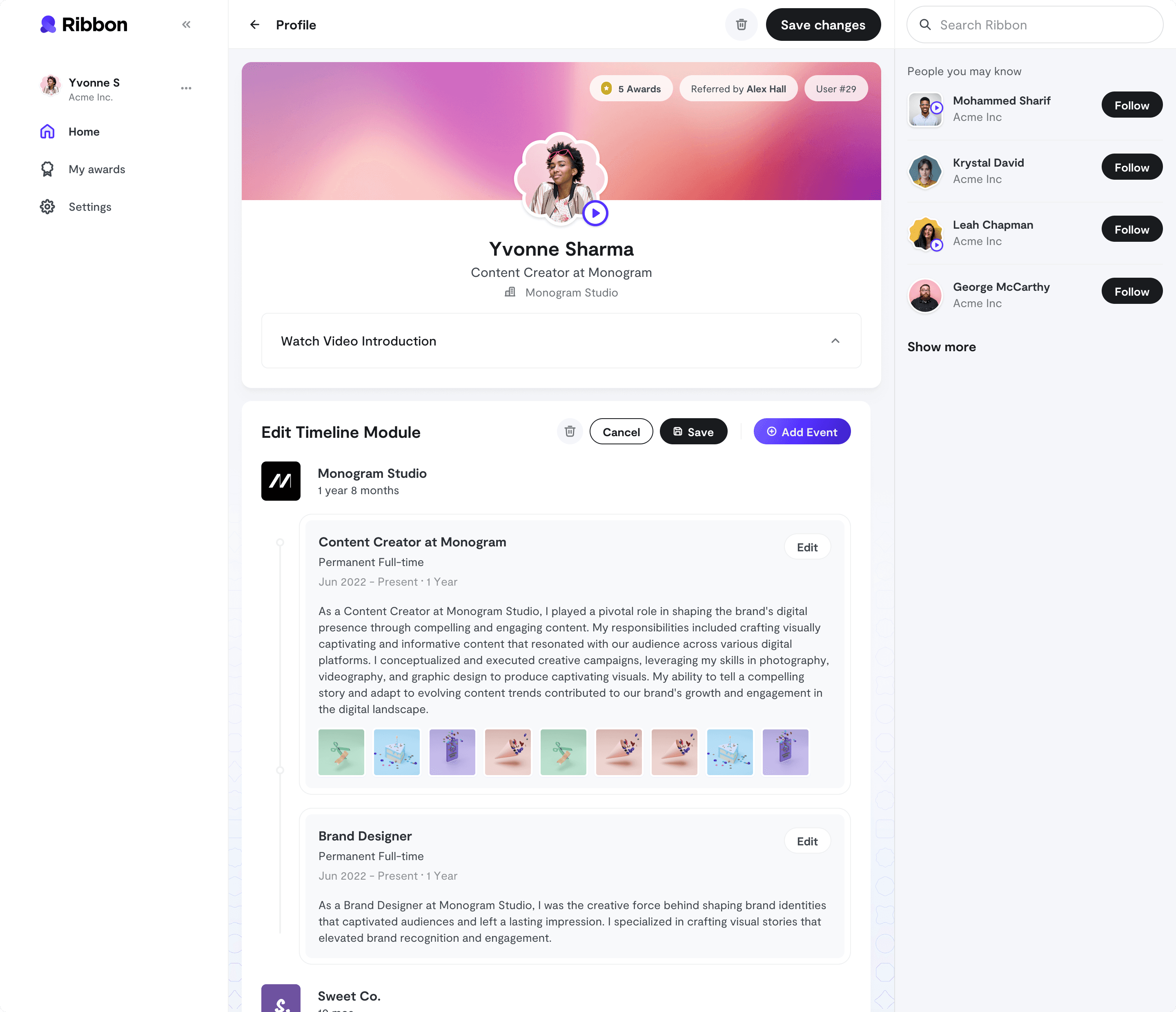
0.7
Timeline Module with Awards Displayed
IMAGE
Next, design a social feed… duh
Our goal was to create a vibrant, scalable achievements feed that celebrates accomplishments, encourages interactions, and provides visibility of profile updates and milestones.
Today, the feed remains a bustling hub, with a thriving community of active users!
Achievement Centric
We made achievement awards the heart of the feed, ensuring they took center stage. We meticulously designed the in-feed cards to showcase achievements, exploring various layouts for a visually pleasing experience.
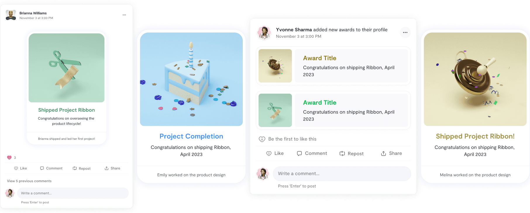
0.8
Feed Components
IMAGE
Create, Send, and Receive Awards
Our goal was to create an intuitive award system, prioritizing streamlined creation and sending. We aimed to provide administrators and users with diverse award types and customization.
Award Creation
The award creation process starts with administrators choosing from diverse award types, such as project-based, educational, and more. We focused on user-friendly award design customization, offering pre-made templates and intuitive design options for a better experience.
0.9
Creating an award
VIDEO LOOP
Award Directory
The awards directory streamlined career achievement tracking and display, featuring AI-suggested awards and organized in a table format for comprehensive award data.
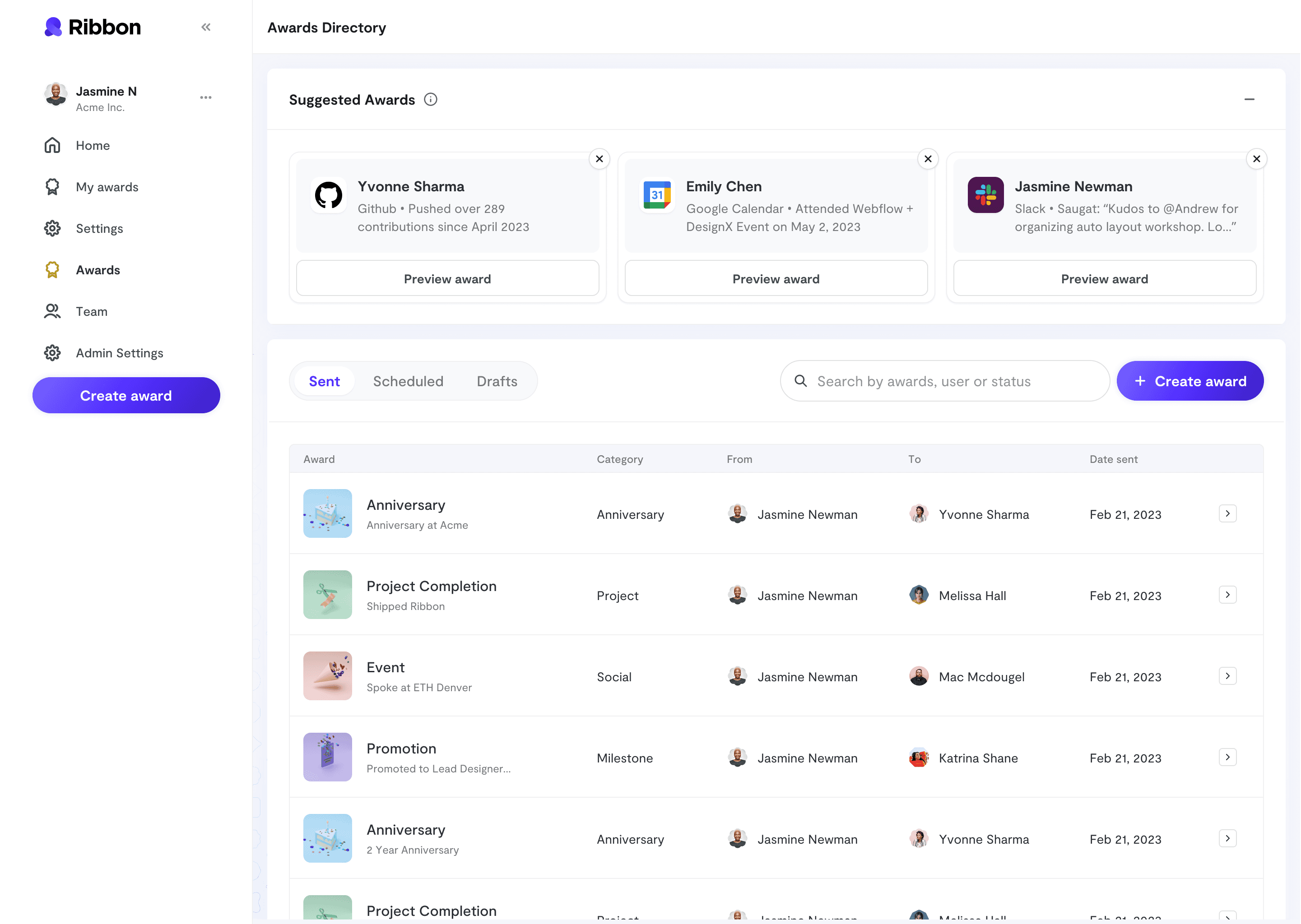
1.0
Admin Awards Directory
IMAGE
RETROSPECTIVE
A beautiful ending.
A HUGE SUCESS
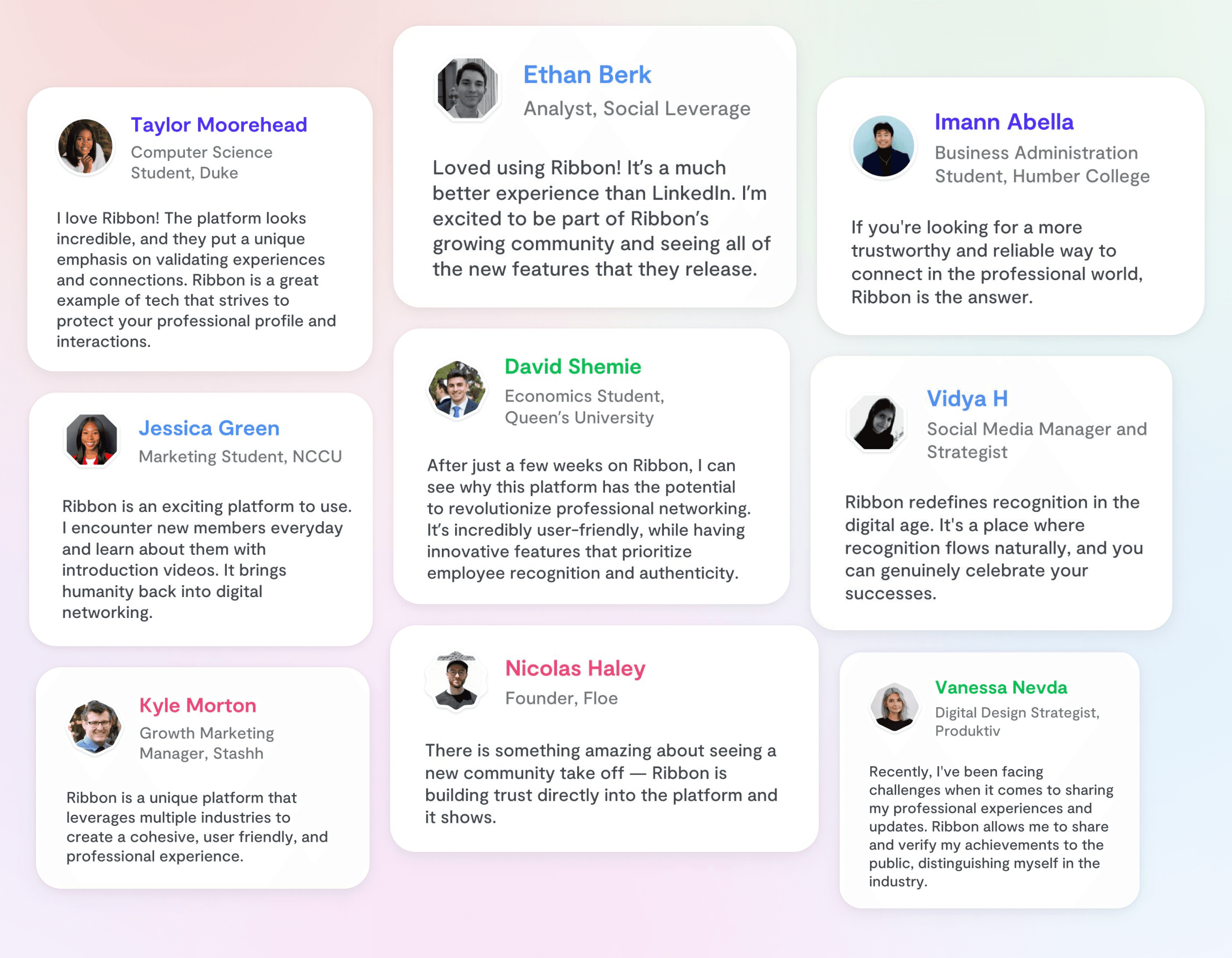
Over 100,000 members are creating profiles, networking, and advancing their careers on Ribbon right now!
1.1
Active User Testimonials
IMAGE
Project Takeaways
Implement user testing often
Regular user feedback was invaluable, more users could have offered even greater insights.
Understanding Diverse User Scenarios
Anticipate diverse user pathways, considering all use cases and constraints, using the CRUD method.
Engaging stakeholders from the start
allowed for holistic project progression and fostered transparent feedback channels.
Prioritize simplicity and clarity
Enhancing clarity often means adding steps, while strong copywriting boosts user experience.

Ribbon
My Role
Product Designer - Visual Design, User Flows, Design systems.
Team
Emily Chung, Lead
Wei-ee Ying, Brand Designer
Timeline & Result
8 months,
Launched in March 2023.
Tools
Figma, Notion, Whimsical, Maze.
Overview
I co-led the complete design lifecycle for Ribbon, a professional social network, overseeing web and mobile experiences for key features.
From concept and low-fidelity wireframes to refined high-fidelity designs, I played a pivotal role in shaping the overall design direction.
The launch received exceptional community feedback, with over 100K signups, marking a successful introduction to the market.
HIGHLIGHTS
An end-to-end updated experience, turning Ribbon into a professional networking and career advancement platform
0.1
Landing Page

0.2
Mobile Mockups

0.3
Desktop Mockups

0.4
Design System Components
CONTEXT
The current professional social networking experience
3 key issues that needed to be addressed:
03
Limited Professional Showcase
Social networks face difficulties in helping users showcase extensive career achievements across multiple job experiences.
01
Lack of Trust and Reliability
User trust is a significant concern due to self-reported data and LinkedIn's removal of 21 million fake accounts (Jan-June 2022).
02
Exhaustive AI Content Overload
Users face an excess of AI-generated content, including 576,562 fake Apple employment listings reported on LinkedIn.
PROBLEM
Constraints we were working with.
The project commenced with a critical visual identity and website launch, but the tight six-month deadline demanded a complete LinkedIn-like redesign with a comprehensive design system
Ambitious six-month deadline: The tight timeline imposed the need for a complete LinkedIn-like redesign of the platform, starting from scratch.
An extensive design system was vital for developer understanding and collaboration in both development and maintenance.
Multi-use case complexity: Adapting to various user types (individuals and companies) under tight feature deadlines.
tHE CHALLENGE
Redefining the conventional social networking experience into a trustworthy and authentic platform
USER FLOWS
Design User Profiles
Our goal was to differentiate ourselves from traditional social media profiles. We designed a refreshing way to setup and display profile details, which was enthusiastically embraced by the Ribbon community.
Customizable & Modular
We empowered users with modularity and customization, offering drag-and-drop templates, customizable avatars, and diverse profile options like projects and video introductions for a personalized experience.
0.5
Editing Profile
Highlight Achievements
We empowered users to showcase awards and achievements with creative layouts and integrated them seamlessly into timeline modules for enhanced visibility

0.6
Awards Module

0.7
Timeline Module with Awards Displayed
Next, design a social feed… duh
Our goal was to create a vibrant, scalable achievements feed that celebrates accomplishments, encourages interactions, and provides visibility of profile updates and milestones.
Today, the feed remains a bustling hub, with a thriving community of active users!
Achievement Centric
We made achievement awards the heart of the feed, ensuring they took center stage. We meticulously designed the in-feed cards to showcase achievements, exploring various layouts for a visually pleasing experience.

0.8
Feed Components
Create, Send, and Receive Awards
Our goal was to create an intuitive award system, prioritizing streamlined creation and sending. We aimed to provide administrators and users with diverse award types and customization.
Award Creation
The award creation process starts with administrators choosing from diverse award types, such as project-based, educational, and more. We focused on user-friendly award design customization, offering pre-made templates and intuitive design options for a better experience.
0.9
Creating an award
Award Directory
The awards directory streamlined career achievement tracking and display, featuring AI-suggested awards and organized in a table format for comprehensive award data.

1.0
Admin Awards Directory
RETROSPECTIVE
A beautiful ending.
A HUGE SUCESS
Over 100,000 members are creating profiles, networking, and advancing their careers on Ribbon right now!

1.1
Active User Testimonials
Project Takeaways
Implement user testing often
Regular user feedback was invaluable, testing with more users could have offered greater insights.
Diverse User Scenarios
Anticipate diverse user pathways, considering all use cases using the CRUD method.
Engaging stakeholders
allowed for holistic project progression and fostered transparent feedback channels.
Prioritize simplicity and clarity
Enhancing clarity often means adding steps, while strong copywriting boosts user experience.

Ribbon
My Role
Product Designer - Visual Design, User Flows, Design systems.
Team
Emily Chung, Lead
Wei-ee Ying, Brand Designer
Timeline & Result
8 months,
Launched in March 2023.
Tools
Figma, Notion, Whimsical, Maze.
Overview
I co-led the complete design lifecycle for Ribbon, a professional social network, overseeing web and mobile experiences for key features.
From concept and low-fidelity wireframes to refined high-fidelity designs, I played a pivotal role in shaping the overall design direction.
The launch received exceptional community feedback, with over 100K signups, marking a successful introduction to the market.
HIGHLIGHTS
An end-to-end updated experience, turning Ribbon into a professional networking and career advancement platform
0.1
Landing Page

0.2
Mobile Mockups

0.3
Desktop Mockups

0.4
Design System Components
CONTEXT
The current professional social networking experience
3 key issues that needed to be addressed:
03
Limited Professional Showcase
Social networks face difficulties in helping users showcase extensive career achievements across multiple job experiences.
01
Lack of Trust and Reliability
User trust is a significant concern due to self-reported data and LinkedIn's removal of 21 million fake accounts (Jan-June 2022).
02
Exhaustive AI Content Overload
Users face an excess of AI-generated content, including 576,562 fake Apple employment listings reported on LinkedIn.
PROBLEM
Constraints we were working with.
The project commenced with a critical visual identity and website launch, but the tight six-month deadline demanded a complete LinkedIn-like redesign with a comprehensive design system
Ambitious six-month deadline: The tight timeline imposed the need for a complete LinkedIn-like redesign of the platform, starting from scratch.
An extensive design system was vital for developer understanding and collaboration in both development and maintenance.
Multi-use case complexity: Adapting to various user types (individuals and companies) under tight feature deadlines.
tHE CHALLENGE
Redefining the conventional social networking experience into a trustworthy and authentic platform
USER FLOWS
Design User Profiles
Our goal was to differentiate ourselves from traditional social media profiles. We designed a refreshing way to setup and display profile details, which was enthusiastically embraced by the Ribbon community.
Customizable & Modular
We empowered users with modularity and customization, offering drag-and-drop templates, customizable avatars, and diverse profile options like projects and video introductions for a personalized experience.
0.5
Editing Profile
Highlight Achievements
We empowered users to showcase awards and achievements with creative layouts and integrated them seamlessly into timeline modules for enhanced visibility

0.6
Awards Module

0.7
Timeline Module with Awards Displayed
Next, design a social feed… duh
Our goal was to create a vibrant, scalable achievements feed that celebrates accomplishments, encourages interactions, and provides visibility of profile updates and milestones.
Today, the feed remains a bustling hub, with a thriving community of active users!
Achievement Centric
We made achievement awards the heart of the feed, ensuring they took center stage. We meticulously designed the in-feed cards to showcase achievements, exploring various layouts for a visually pleasing experience.

0.8
Feed Components
Create, Send, and Receive Awards
Our goal was to create an intuitive award system, prioritizing streamlined creation and sending. We aimed to provide administrators and users with diverse award types and customization.
Award Creation
The award creation process starts with administrators choosing from diverse award types, such as project-based, educational, and more. We focused on user-friendly award design customization, offering pre-made templates and intuitive design options for a better experience.
0.9
Creating an award
Award Directory
The awards directory streamlined career achievement tracking and display, featuring AI-suggested awards and organized in a table format for comprehensive award data.

1.0
Admin Awards Directory
RETROSPECTIVE
A beautiful ending.
A HUGE SUCESS
Over 100,000 members are creating profiles, networking, and advancing their careers on Ribbon right now!

1.1
Active User Testimonials
Project Takeaways
Implement user testing often
Regular user feedback was invaluable, testing with more users could have offered greater insights.
Diverse User Scenarios
Anticipate diverse user pathways, considering all use cases using the CRUD method.
Engaging stakeholders
allowed for holistic project progression and fostered transparent feedback channels.
Prioritize simplicity and clarity
Enhancing clarity often means adding steps, while strong copywriting boosts user experience.

Ribbon
My Role
Product Designer - Visual Design, User Flows, Design systems.
Team
Emily Chung, Lead
Wei-ee Ying, Brand Designer
Timeline & Result
8 months,
Launched in March 2023.
Tools
Figma, Notion, Whimsical, Maze.
Overview
I co-led the complete design lifecycle for Ribbon, a professional social network, overseeing web and mobile experiences for key features.
From concept and low-fidelity wireframes to refined high-fidelity designs, I played a pivotal role in shaping the overall design direction.
The launch received exceptional community feedback, with over 100K signups, marking a successful introduction to the market.
HIGHLIGHTS
An end-to-end updated experience, turning Ribbon into a professional networking and career advancement platform


CONTEXT
The current social
networking experience
3 key issues that needed to be addressed:
01
Lack of Trust and Reliability
User trust is a significant concern due to self-reported data and LinkedIn's removal of 21 million fake accounts (Jan-June 2022).
02
Exhaustive AI Content Overload
Users face an excess of AI-generated content, including 576,562 fake Apple employment listings reported on LinkedIn.
03
Limited Professional Showcase
Social networks face difficulties in helping users showcase extensive career achievements across multiple job experiences.
PROBLEM
Constraints we were
working with.
The project commenced with a critical visual identity and website launch, but the tight six-month deadline demanded a complete LinkedIn-like redesign with a comprehensive design system
Ambitious six-month deadline: The tight timeline imposed the need for a complete LinkedIn-like redesign of the platform, starting from scratch.
An extensive design system was vital for developer understanding and collaboration in both development and maintenance.
Multi-use case complexity: Adapting to various user types (individuals and companies) under tight feature deadlines.
tHE CHALLENGE
Redefining the conventional social networking experience into a
trustworthy and authentic platform
USER FLOWS
Design User Profiles
Our goal was to differentiate ourselves from traditional social media profiles. We designed a refreshing way to setup and display profile details, which was enthusiastically embraced by the Ribbon community.
Customizable & Modular
We empowered users with modularity and customization, offering drag-and-drop templates, customizable avatars, and diverse profile options like projects and video introductions for a personalized experience.
Highlight Achievements
We empowered users to showcase awards and achievements with creative layouts and integrated them seamlessly into timeline modules for enhanced visibility


Next, design a social feed… duh
Our goal was to create a vibrant, scalable achievements feed that celebrates accomplishments, encourages interactions, and provides visibility of profile updates and milestones.
Today, the feed remains a bustling hub, with a thriving community of active users!
Achievement Centric
We made achievement awards the heart of the feed, ensuring they took center stage. We meticulously designed the in-feed cards to showcase achievements, exploring various layouts for a visually pleasing experience.

Create, Send, and Receive Awards
Our goal was to create an intuitive award system, prioritizing streamlined creation and sending. We aimed to provide administrators and users with diverse award types and customization.
Award Creation
The award creation process starts with administrators choosing from diverse award types, such as project-based, educational, and more. We focused on user-friendly award design customization, offering pre-made templates and intuitive design options for a better experience.
Award Directory
The awards directory streamlined career achievement tracking and display, featuring AI-suggested awards and organized in a table format for comprehensive award data.

RETROSPECTIVE
A beautiful ending.
A HUGE SUCESS
Over 100,000 members are creating profiles, networking, and advancing their careers on Ribbon right now!

Project Takeaways
Implement user testing often
Regular user feedback was invaluable, more users could have offered even greater insights.
Understanding Diverse User Scenarios
Anticipate diverse user pathways, considering all use cases and constraints, using the CRUD method.
Engaging stakeholders from the start
allowed for holistic project progression and fostered transparent feedback channels.
Prioritize simplicity and clarity
Enhancing clarity often means adding steps, while strong copywriting boosts user experience.

Ribbon
My Role
Product Designer - Visual Design, User Flows, Design systems.
Team
Emily Chung, Lead
Wei-ee Ying, Brand Designer
Timeline & Result
8 months,
Launched in March 2023.
Tools
Figma, Notion, Whimsical, Maze.
Overview
I co-led the complete design lifecycle for Ribbon, a professional social network, overseeing web and mobile experiences for key features.
From concept and low-fidelity wireframes to refined high-fidelity designs, I played a pivotal role in shaping the overall design direction.
The launch received exceptional community feedback, with over 100K signups, marking a successful introduction to the market.
HIGHLIGHTS
An end-to-end updated experience, turning Ribbon into a professional networking and career advancement platform


CONTEXT
The current social
networking experience
3 key issues that needed to be addressed:
01
Lack of Trust and Reliability
User trust is a significant concern due to self-reported data and LinkedIn's removal of 21 million fake accounts (Jan-June 2022).
02
Exhaustive AI Content Overload
Users face an excess of AI-generated content, including 576,562 fake Apple employment listings reported on LinkedIn.
03
Limited Professional Showcase
Social networks face difficulties in helping users showcase extensive career achievements across multiple job experiences.
PROBLEM
Constraints we were
working with.
The project commenced with a critical visual identity and website launch, but the tight six-month deadline demanded a complete LinkedIn-like redesign with a comprehensive design system
Ambitious six-month deadline: The tight timeline imposed the need for a complete LinkedIn-like redesign of the platform, starting from scratch.
An extensive design system was vital for developer understanding and collaboration in both development and maintenance.
Multi-use case complexity: Adapting to various user types (individuals and companies) under tight feature deadlines.
tHE CHALLENGE
Redefining the conventional social networking experience into a
trustworthy and authentic platform
USER FLOWS
Design User Profiles
Our goal was to differentiate ourselves from traditional social media profiles. We designed a refreshing way to setup and display profile details, which was enthusiastically embraced by the Ribbon community.
Customizable & Modular
We empowered users with modularity and customization, offering drag-and-drop templates, customizable avatars, and diverse profile options like projects and video introductions for a personalized experience.
Highlight Achievements
We empowered users to showcase awards and achievements with creative layouts and integrated them seamlessly into timeline modules for enhanced visibility


Next, design a social feed… duh
Our goal was to create a vibrant, scalable achievements feed that celebrates accomplishments, encourages interactions, and provides visibility of profile updates and milestones.
Today, the feed remains a bustling hub, with a thriving community of active users!
Achievement Centric
We made achievement awards the heart of the feed, ensuring they took center stage. We meticulously designed the in-feed cards to showcase achievements, exploring various layouts for a visually pleasing experience.

Create, Send, and Receive Awards
Our goal was to create an intuitive award system, prioritizing streamlined creation and sending. We aimed to provide administrators and users with diverse award types and customization.
Award Creation
The award creation process starts with administrators choosing from diverse award types, such as project-based, educational, and more. We focused on user-friendly award design customization, offering pre-made templates and intuitive design options for a better experience.
Award Directory
The awards directory streamlined career achievement tracking and display, featuring AI-suggested awards and organized in a table format for comprehensive award data.

RETROSPECTIVE
A beautiful ending.
A HUGE SUCESS
Over 100,000 members are creating profiles, networking, and advancing their careers on Ribbon right now!

Project Takeaways
Implement user testing often
Regular user feedback was invaluable, more users could have offered even greater insights.
Understanding Diverse User Scenarios
Anticipate diverse user pathways, considering all use cases and constraints, using the CRUD method.
Engaging stakeholders from the start
allowed for holistic project progression and fostered transparent feedback channels.
Prioritize simplicity and clarity
Enhancing clarity often means adding steps, while strong copywriting boosts user experience.